Image optimization means reducing image file size while keeping visual quality strong.
Methods include compression, resizing, proper formatting, responsive delivery, and smart loading techniques.
Interactive mobile platforms rely heavily on visuals because images guide users, support engagement, and make content feel active.
Visual content can make screens easier to understand, more attractive, and more useful during user interaction.
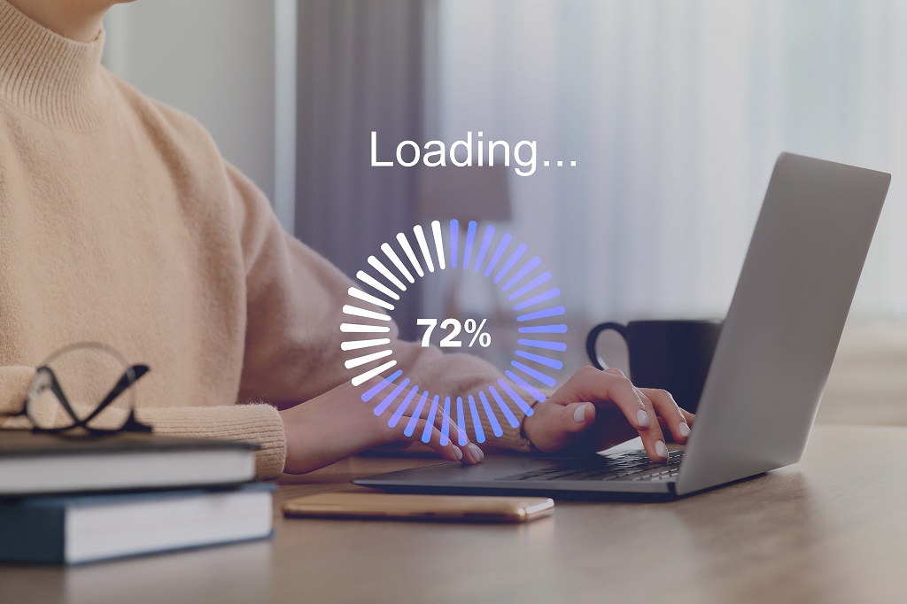
Large image files, however, can create serious problems on mobile devices. Heavy visuals can slow loading, delay user actions, and frustrate people using slower or unstable connections.
Mobile users expect quick access, smooth scrolling, fast tapping, and clear visual feedback.
When images take too long to load, a platform can feel broken or poorly built.
Lazy Loading Improves Initial Load Performance
Lazy loading delays image loading until images are near or inside the user’s viewport. Instead of loading every image immediately, a platform loads the images users are most likely to see first.
As a result, initial page load time can decrease because the browser has fewer assets to request at once.
Lazy loading also reduces unnecessary bandwidth use because users may never scroll far enough to view every image on a page.
For mobile users with limited data, weak connections, or slower networks, saving can improve both performance and usability.
Interactive mobile platforms benefit greatly when lazy loading is used on feeds, galleries, product listings, image-heavy articles, dashboards, and recommendation sections.
Loading only visible or near-visible images helps the first screen appear faster and lets users begin interacting sooner.
Lazy loading can also improve performance when platforms use many high-resolution images or images with transparency that may otherwise add extra file weight.
Gaming pages, casino-style interfaces, and instant-play platforms such as desi play aviator need fast visual loading because users expect the screen to respond quickly before gameplay begins.
Mobile Platforms Depend on Speed

Mobile platforms depend on speed because users often access them through wireless networks that can be slower or less stable than desktop internet connections.
Large, unoptimized images increase page weight and can make screens load much more slowly.
Slow loading often leads users to leave before they interact with content, products, dashboards, or features.
Several mobile interactions rely on fast image delivery to feel smooth and responsive:
- Scrolling through image-heavy feeds needs quick asset loading so movement does not feel delayed.
- Tapping product thumbnails works better when preview images appear without long waits.
- Swiping through galleries feels more natural when each image is already compressed and properly sized.
- Opening dashboards feels faster when charts, icons, and visual panels use lightweight files.
Lightweight images reduce loading delays and help users reach content faster on mobile devices.
Faster image delivery also supports smoother actions such as scrolling, tapping, swiping, opening product galleries, viewing dashboards, and moving between screens.
Interactive platforms need fast visual response because users judge performance through each action they take.
Compression can significantly reduce image file size without always causing visible quality loss.
Smaller files move across networks faster, use less device memory, and help pages become usable sooner.
Image optimization should be treated as a core speed strategy, not as a small design adjustment added later.
Image Optimization Improves User Experience
Interactive mobile platforms must feel immediate, clear, and easy to use. Slow-loading images interrupt user flow and make a platform feel unresponsive.
When users tap, scroll, or open a screen, they expect visual content to appear quickly and fit naturally into the interface.
Optimized images help users access content and interact with a platform more smoothly.
Better image performance reduces frustration, supports easier navigation, and encourages users to continue using the platform.
Fast image loading also makes product pages, social feeds, galleries, dashboards, and content previews feel more reliable.
User experience improves when image optimization supports both speed and clarity:
- Clear product photos help users compare items without waiting on oversized files.
- Fast-loading profile images make social or account-based screens feel more complete.
- Stable image areas reduce sudden layout shifts that can cause accidental taps.
- Clean thumbnails help users scan content quickly on small screens.
High-quality optimized visuals maintain a professional look without causing unnecessary delays. Good optimization does not mean poor image quality.
Instead, it means removing unnecessary file weight while keeping images sharp, clear, and useful.
Better image performance can encourage users to stay longer, interact more, and complete actions such as signing up, purchasing, reading, sharing, or navigating through content.
Optimized Images Support Mobile-First Design
Mobile-first design requires images suited for smaller screens, different resolutions, and changing network conditions.
Mobile users should not have to download oversized desktop images when a smaller version would look just as good on their device.
Responsive image delivery helps solve that problem by giving each device an image size that matches its screen and display needs.
Images should be resized to fit mobile screens instead of being delivered at full desktop dimensions. Proper image dimensions help browsers load assets faster and improve layout stability.
When image sizes are defined correctly, pages can reserve space for visuals and avoid sudden layout shifts that disrupt reading, tapping, or scrolling.
Responsive image handling depends on a few practical choices:
- Smaller image versions should be available for narrow screens.
- Higher-density displays may need sharper assets without unnecessary file weight.
- Cropped mobile images should keep important visual details visible.
- Image containers should match layout needs before loading begins.
Responsive techniques such as srcset and sizes allow a platform to deliver different image versions based on device width, screen density, and layout needs.
Cropping, resizing, and dimension management also help protect image quality while reducing unnecessary file weight.
For interactive mobile platforms, mobile-first image handling keeps visual content useful without slowing the interface.
File Format Selection Matters
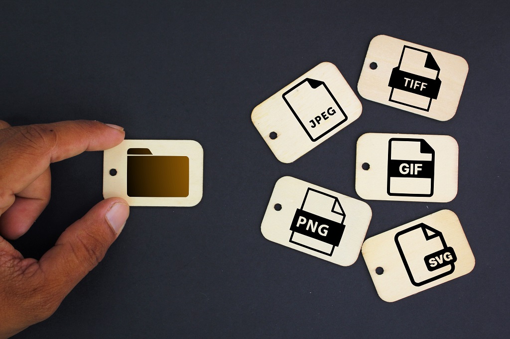
Choosing the correct image format can reduce file size while preserving visual clarity.
Each format works best for certain image types, so format selection should match the purpose of the visual.
WebP offers strong compression and quality retention, making it useful for many mobile images.
JPEG works well for photographs and images with gradients because it can reduce file size effectively while keeping photos visually acceptable.
PNG is useful for images that need transparency, although it can create larger files than other options.
Format decisions should be based on how each image works inside the platform:
- Product photos often need compression that protects color and detail.
- Interface icons need sharp edges at different screen sizes.
- Transparent overlays need a format that supports alpha channels.
- Logos need clean scaling without blurry edges.
- Thumbnails need very small file sizes because many may load together.
SVG works well for logos and icons because it scales cleanly on different screen sizes and often has a very small file size.
AVIF can offer very small file sizes and strong compression efficiency, depending on image complexity and encoder settings.
Poor format choice can create unnecessary file weight, while proper format choice helps balance speed, quality, transparency, animation, and scalability.
Interactive platforms should match format choice to image purpose. Photographs, icons, interface graphics, product images, thumbnails, and illustrations may each need different handling.
Correct format selection helps images load faster while still looking clean and professional.
Compression Balances Quality and Performance

Compression reduces file size so images load faster while still looking visually acceptable.
Lossy compression works well for photographs because small quality reductions are often difficult to notice.
Lossless compression is better for graphics that require exact reproduction, such as certain icons, diagrams, or interface elements.
A successful compression process removes unnecessary image data without making visuals look blurry, pixelated, or unprofessional.
Strong compression can damage image quality when used carelessly, so testing is important.
Testing compression should focus on details users actually notice:
- Faces and product edges should stay clear.
- Text inside graphics should stay readable.
- Gradients should not show obvious banding.
- Transparent graphics should not have rough edges.
- Repeated thumbnails should load quickly without looking degraded.
Compression is especially important for mobile platforms that use images frequently.
Product cards, social feeds, galleries, profile images, thumbnails, and content previews can add significant weight when many images appear on one screen or across several screens.
Automated compression tools and plugins can help maintain performance across large image libraries by applying consistent file-size reductions during upload or deployment.
Summary
Image optimization is essential for interactive mobile platforms because visuals are central to engagement, but heavy visuals can damage performance.
Optimized images make mobile platforms faster, smoother, easier to use, and better suited to mobile-first experiences.
Every image on an interactive mobile platform should be treated as both a design asset and a performance responsibility.
Strong image optimization helps users load content faster, interact more smoothly, use less bandwidth, and experience a platform that feels reliable, polished, and responsive.