When most people launch a new e-commerce website, they focus almost entirely on products, pricing, and ads. Design is treated as decoration. In reality, design is not decoration at all. It is the silent system that controls trust, attention, and buying behavior.
Visitors decide whether to stay, scroll, or leave your site within the first three to five seconds. That decision is driven almost entirely by layout clarity, visual balance, and how mentally safe the website feels to navigate.
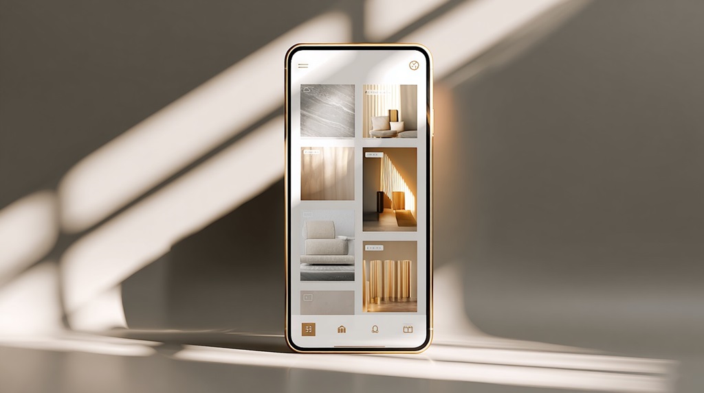
First Impressions Are Built on Structure, Not Branding

Most failed e-commerce websites do not fail because the product is bad. They fail because the structure is confusing. When a visitor lands on a new store, their brain immediately asks three questions:
What is this? Is it safe? Can I find what I need quickly?
If the structure does not answer these questions instantly, the visitor exits without scrolling. Visibility of navigation, spacing between sections, category clarity, and headline hierarchy matter more than logo style or color mood.
A clean grid, readable text, and predictable placement of search, cart, and categories create instant mental safety. Once safety exists, curiosity activates. Once curiosity activates, scrolling begins.
Why White Space and Visual Breathing Sell More Than Dense Layouts

New store owners often try to “show everything” above the fold. This creates visual overload. When the eye has nowhere to rest, the brain stops processing. White space is not space. It is attention control. It allows products, headlines, price blocks, and call-to-action buttons to stand out cleanly.
Stores with proper spacing feel calmer, more transparent, and more trustworthy. Visitors move more slowly through calm layouts. Slower movement increases reading depth. Deeper reading increases buying probability.
Dense layouts rush the visitor emotionally, even when no urgency exists.
Product Pages Convert When Information Is Layered, Not Dumped
Most modern buyers do not read product pages top to bottom. They scan in layers. Title first. Then price. Then images. Then one key benefit. Then social proof. Then, specifications are only provided if trust has been earned.
When new e-commerce sites dump technical details, shipping rules, policies, and descriptions into one block, conversion drops. Smart design separates information into progressive layers that reveal themselves as confidence increases.
High-Converting Product Page Information Flow
| Viewing Stage | What the Buyer Needs |
| First 3 seconds | Clear product purpose, price visibility |
| First scroll | Primary benefits and use case |
| Second scroll | Reviews, social proof, real photos |
| Deeper scroll | Specifications, materials, sizing |
| Final stage | Shipping, returns, warranty |
When design follows this psychological order, checkout hesitation drops without changing product copy at all.
Typography Quietly Controls How Long People Stay
Text fatigue is one of the most common reasons people abandon product pages. This is rarely caused by content length. It is caused by poor typography. Font size, line height, contrast, and spacing decide whether the brain feels strain while reading.
Readable stores use slightly larger body fonts, relaxed vertical spacing, and high contrast between text and background. Small type does not look premium anymore. It looks difficult. Difficult reading creates mental resistance. Mental resistance blocks purchase momentum.
Mobile Design Is Where Most New Stores Lose the Sale
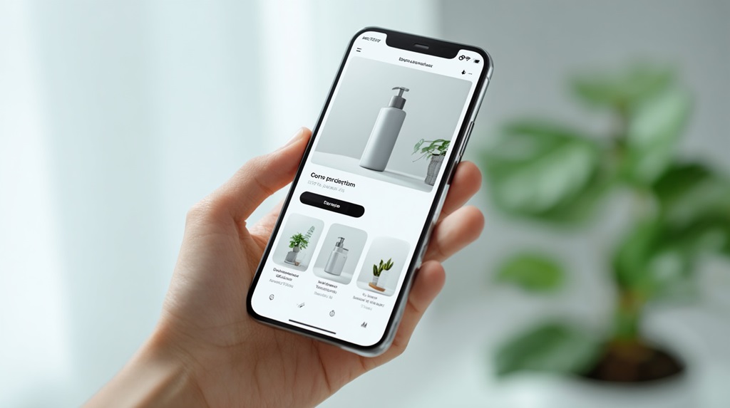
More than 70 percent of most e-commerce traffic now comes from mobile. Yet many new stores still design primarily for desktop appearance. The result is tiny buttons, cramped text, complex menus, and checkout forms that feel impossible to complete on a phone.
Mobile-first design is not about shrinking desktop layouts. It is about rebuilding hierarchy for thumbs, vertical scrolling, and distraction-heavy environments. Add-to-cart buttons must be easily reachable. Product images must fill the screen clearly. Checkout steps must feel short and safe.
For many new e-commerce founders, design limitations are not about taste, but about capital timing. When early cash flow is tight, design shortcuts often get justified even when they silently damage conversion.
Some founders solve this gap by securing short-term operational funding through firms like Exec Capital, allowing them to invest in high-impact design fixes such as mobile optimization, checkout simplification, and trust-layer improvements without stalling growth or waiting for organic revenue to catch up. When used responsibly, this kind of bridge funding often pays for itself through higher conversion efficiency rather than increased ad spend.
Trust Signals Must Be Visible Before You Ask for Money
New visitors do not trust new stores by default. This distrust is silent but powerful. Before a visitor enters payment details, their brain searches for reassurance signals: reviews, real product photos, clear return rules, and visible contact access.
Trust is not built with one big badge at checkout. It is built with repeated micro reassurances throughout the entire browsing journey. Logos of secure payments, real customer photos, delivery time estimates, and transparent policies create cumulative confidence.
Core Trust Signals That Increase Checkout Confidence
| Trust Signal | Why It Works |
| Real reviews | Reduces uncertainty |
| Delivery estimate | Reduces anxiety |
| Clear return rules | Reduces risk |
| Real photos | Signals authenticity |
| Visible contact info | Signals legitimacy |
Micro Animations and Load Feedback Reduce Abandonment
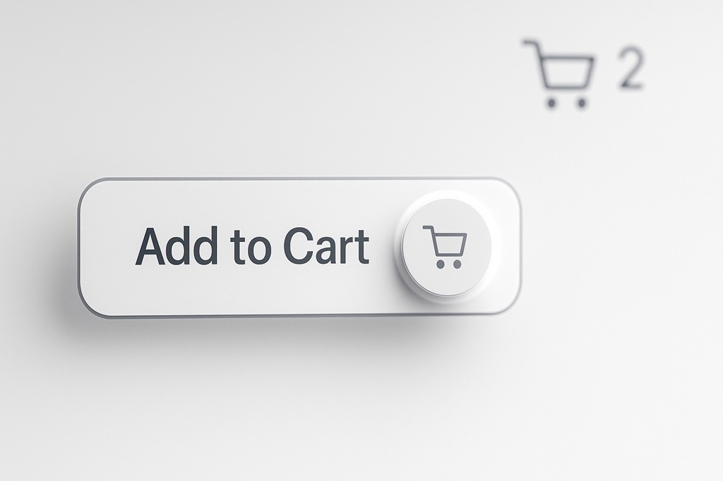
One of the quiet killers of conversion is “dead screen anxiety.” When people click a button and nothing happens instantly, the brain assumes failure. Even small design feedback, such as loading animations, button state changes, and cart update transitions, dramatically reduces abandonment.
These micro cues do not need to be fancy. A subtle loading spinner, a cart refresh animation, or a button confirmation state is enough to reassure the user that the system is responding.
Navigation Must Make Exploration Feel Effortless
Complex menus trap buyers mentally. Clean navigation releases them. High-performing e-commerce websites limit primary categories, group subcategories logically, and use predictive search to shorten browsing time.
When exploration feels easy, users browse longer. The longer they browse, the more emotional attachment builds to the products. Emotional attachment is what converts passive browsing into active buying.
Check Out Design Decides Whether You Get Paid or Not
A new e-commerce store often loses 40 to 70 percent of buyers at checkout. This is rarely due to price. It is usually due to friction. Long forms, forced account creation, unclear shipping fees, and surprise taxes trigger exit.
High-conversion checkouts feel short, predictable, and reversible. Single-page checkout, guest checkout options, auto-filled address fields, and cost transparency before final confirmation all increase completed transactions.
Why Small Improvements Beat Full Redesigns
Many store owners delay optimization while “planning a full redesign.” In reality, conversion improvements come faster from small adjustments tested gradually. Changing one element at a time allows you to understand what actually affects behavior.
Examples of small but powerful changes include:
- Increasing body font size slightly
- Adding product photos inside reviews
- Moving the delivery time above the fold
- Reducing checkout form fields
- Clarifying the primary call-to-action color
None of these changes feels dramatic visually. Combined, they can increase revenue without adding a single new visitor.
Conclusion
Design does not convince people to buy. It removes the reasons they hesitate. When structure is clean, navigation is predictable, typography is relaxed, trust is layered gradually, and checkout feels safe, buying becomes the natural next step instead of a risky decision.
New e-commerce stores fail not because they lack traffic, but because they leak attention through friction. Small design improvements close those leaks quietly. When resistance disappears, conversion rises without pressure.
This is why disciplined micro design always outperforms dramatic redesigns in the long run.