A YouTube banner is the first thing someone sees when they land on a channel, long before they ever press play. It hangs across the top of your page like a front porch sign, greeting every visitor.
The tricky part is getting one design to survive all those screen shapes without losing half your message. You would think designers have it easy, but YouTube crops aggressively. Mobile trims a lot. Tablets behave differently. A desktop gives you a little more width. TV blows the whole canvas open.
Plenty of creators try to fix it by stuffing more content in. The results usually go sideways. Words end up chopped. Logos fall off cliffs. Backgrounds stretch or look pixelated. It gets messy fast.
The way around that pain is not to make a bigger banner or pull a random template from a marketplace. The real solution sits in the specs, the safe area, and a simple plan for how to treat each part of the canvas.
In this guide, we will walk you through each step: the correct size, what YouTube means by safe area, how to keep your banner from getting sliced on mobile, and how to export it without losing quality. It also includes layout recipes that work across devices, along with common mistakes creators keep repeating. Let’s get right into it.
YouTube Banner Size Requirements You Must Follow
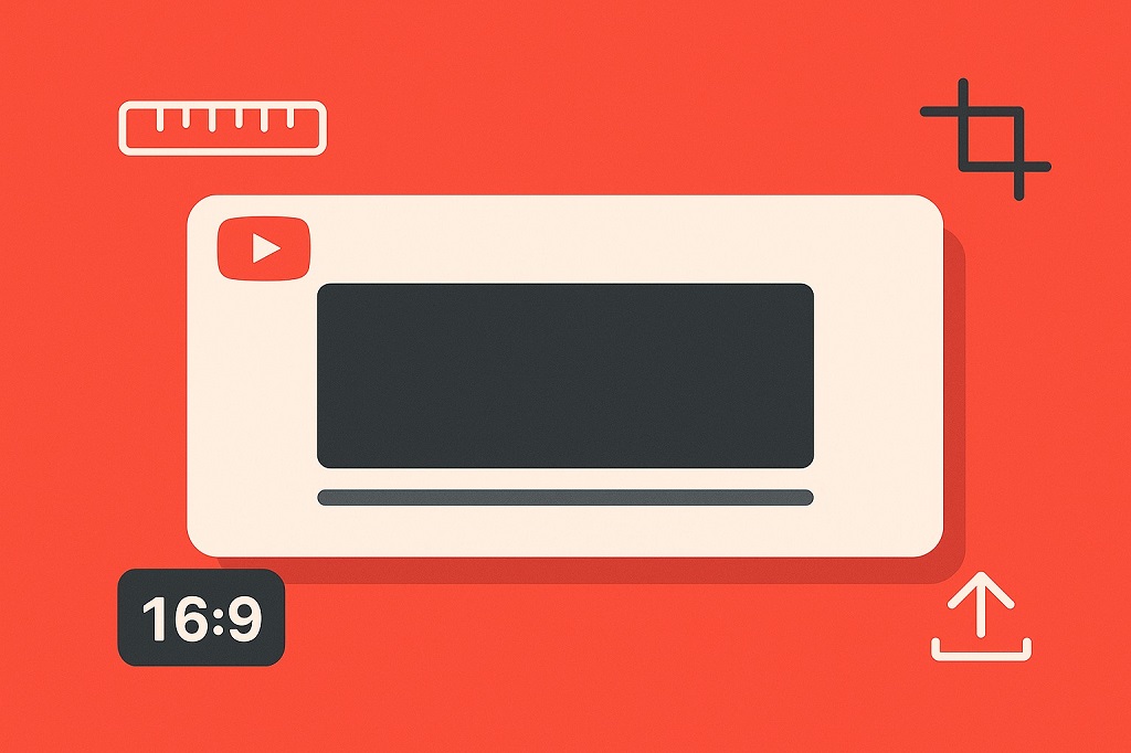
YouTube lists official channel banner requirements in its Help Center. You do not need to memorize the whole list, but you need to follow the essentials or your upload will either reject, blur, or crop in unpredictable ways.
Here is the core technical guidance:
- Recommended banner size: 2560 x 1440 px
- Minimum upload size: 2048 x 1152 px (16:9)
- Maximum file size: 6 MB
- Safe area (recommended size): 1546 x 423 px , dead center
- Safe area (minimum size): 1235 x 338 px , dead center
- Allowed formats: JPG, PNG, GIF (non animated), BMP
To make it easier, here is the table format:
| Item | Official Guidance |
| Recommended banner size | 2560 x 1440 px |
| Minimum upload size | 2048 x 1152 px (16:9) |
| Max file size | 6 MB |
| Safe area at recommended size | 1546 x 423 px |
| Safe area at minimum size | 1235 x 338 px |
| Allowed formats | JPG, PNG, GIF (non animated), BMP |
The recommended dimensions exist for a reason. Large screens, especially TVs, stretch the banner across a wide surface.
If your source file is too small, the banner blurs. If it is too big, export size becomes a problem, and YouTube may compress it further than you want. The 2560 x 1440 frame hits the balance.
Why YouTube Uses a Safe Area
A YouTube banner is a single image file. In practice, YouTube crops that file differently depending on the device. Phones cut off the sides. The desktop shows more. TV shows nearly everything.
Only the center area stays visible everywhere, so YouTube explicitly advises creators to keep logos and text in that safe zone. If something sits outside it, assume it will be chopped off on at least one device.
Think of the safe area as your billboard space. Everything outside it can look nice, but it cannot carry important information. If you treat the outer edges as decorative scenery, your banner will survive any screen size.
How to Design So Nothing Gets Cropped
What must stay inside the safe area
Everything that matters goes in that 1546 x 423 rectangle:
- Your channel name or shortened version
- A logo or icon if you use one
- A tagline or posting cadence, kept short
- Any message that must remain readable
Adobe’s banner advice reinforces this principle. It outlines clearly that creators need to keep text, logos, and focal elements inside the safe zone to guarantee consistent display across devices.
The simplest layout strategy
Try arranging your banner in three layers:
- Center (safe area): the message, the logo, and any essential text
- Mid zone: supporting visuals such as textures, subtle gradients, soft shapes
- Outer edges: pure decoration, no faces, no text, nothing small
The mid zone functions like a transition ground, while the outer edges sit as atmosphere. When the banner gets cropped, only the atmosphere disappears, not your content.
Add a safe-area guide to your design file
Every tool you use should have a guide. Set your canvas to 2560 x 1440 , then draw a centered rectangle sized 1546 x 423 .
Lock it. That is your “do not cross” boundary for essential content. The more rigid you are with this, the less cleanup you will do later.
Design Tips That Make a Banner Look Professional
YouTube recommends that your banner match your channel identity. In simple terms, viewers should immediately feel like your banner, thumbnails, and videos belong to the same creator. When everything aligns, the channel feels polished and intentional.
Below are the practical moves that matter the most.
1. Answer one question fast: “What is this channel?”
A viewer scans a banner for only a moment. If you deliver a single clear signal, you win. That signal might be:
- A topic: “Cycling maintenance and gear reviews.”
- An audience: “Math help for high school and college students.”
- A format: “Long form interviews and breakdowns.”
- A tone cue: “Dry humor, strong research, calm pace.”
Pick one. Keep it obvious. No need to cram multiple angles into one narrow safe area.
2. Use short text and large type
Text shrinks aggressively on mobile. If you want it to remain readable:
- Keep the headline under seven words
- Use chunky, bold, or medium-weight fonts
- Avoid ultra-thin typefaces
- Increase tracking slightly to help legibility
A viewer already sees your channel name under the banner, so the banner itself can communicate purpose instead of repeating the same words.
For example, a channel called “Daylight Workshop” could use a banner that simply says “Woodworking Tips and Shop Projects.”
3. Keep contrast simple and strong
Text on top of a photo needs help. You can achieve clarity with:
- A subtle dark overlay behind the text
- A gentle blur behind the center area
- A centered panel with a solid color
- A vignette that naturally draws attention inward
Do not aim for delicate visual poetry. Aim for readability.
4. Skip borders, frames, and fake shadows
YouTube’s Help Center guidance warns against extra borders, drop shadows, and decorative frames.
They do not scale well. They break when cropped. They leave awkward lines at odd zoom levels. Clean edges always look better.
5. Pick one focal point
If your banner shows a portrait or a product:
- Place the subject near the center
- Avoid tiny faces or props
- Give the subject enough breathing room
- Keep the focal area inside the safe zone
Too many focal points confuse the eye. One strong focus builds brand memory.
6. Match your thumbnails rather than your mood
Your banner sets the tone for everything else on your channel. If your thumbnails use bold yellow accents and heavy text, your banner should echo that energy.
If your thumbnails lean minimal, keep the banner minimal too. Consistent palettes, repeated typefaces, and similar visual rhythm help viewers recognize your work instantly.
YouTube’s branding recommendations repeatedly mention the value of coordinated visual identity across channel art, thumbnails, and profile imagery.
A Practical Banner Build Workflow
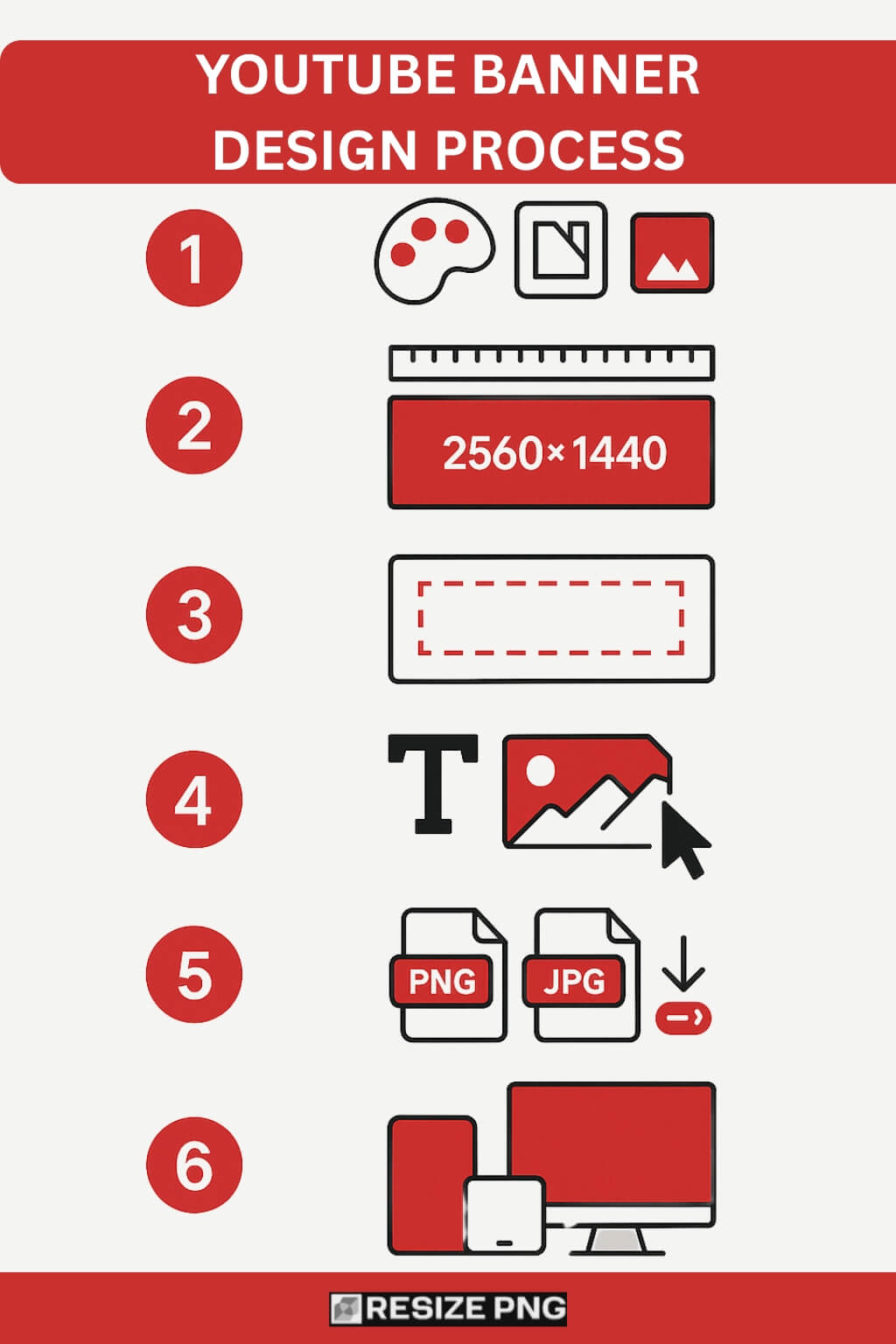
Step 1: Pick your tool
Choose whatever matches your comfort level. You do not need advanced software. You only need control over layout and export quality.
Options include:
- Canva, which comes with preset sizes
- Adobe Express, which offers easy resizing tools
- Photoshop, Figma, Affinity, or any digital design software you already know
As long as you can set guides, center elements, and export without quality loss, you are fine.
Step 2: Set your canvas to 2560 x 1440
Start with the recommended dimensions. It gives you the best balance for mobile, desktop, and TV. The minimum size works, but it leaves less margin for scaling.
Step 3: Add your safe-area rectangle
Draw a 1546 x 423 rectangle and center it. Lock it. Everything important stays inside. Anything outside can be decoration.
Step 4: Build your layout layer by layer
A clean order keeps your file manageable:
- Background: color, gradient, photo, or texture
- Focal image: you, a product, a mascot, or nothing
- Text hierarchy: headline, optional subline, optional tagline
- Logo: only if it adds clarity
- Contrast tweaks: overlays, vignettes, blur, soft panels
Always zoom out frequently. Banners need to read at a glance.
Step 5: Export without ruining quality
YouTube supports several formats, but PNG and JPG handle most cases.
Use:
- PNG for text-heavy or graphic-heavy banners
- High-quality JPG for photo-heavy banners
If you need a quick way to resize an image before exporting, you can resize the Image to 1024×576 pixels to prepare your file.
If the file is larger than 6 MB:
- Reduce JPG quality to around 80 or 85
- Compress PNGs gently with a trusted tool
- Avoid resizing the canvas to odd resolutions
Export at full size to preserve clarity.
Step 6: Upload and preview in YouTube Studio
Inside YouTube Studio, channel branding and customization include the banner upload option. After uploading, review each preview mode:
- Mobile
- Desktop
- TV
Look for cut-off text, awkward cropping, fuzzy imagery, and any spot where the safe area rules might have slipped.
Why Designing for TV Matters More Now
YouTube shared that TV viewing crossed one billion hours per day globally. That tells you a lot about how your banner might show up in the wild.
Large screens reveal the entire banner, including areas that stay hidden on mobile. If the outer area looks like an afterthought, the banner feels unfinished on a television.
To avoid that:
- Give the outer area a cohesive background
- Use high-resolution images
- Make gradients smooth instead of blotchy
- Keep edges clean and purposeful
Think of the outer zone as your set design, not empty filler.
Common Banner Mistakes and How to Fix Them
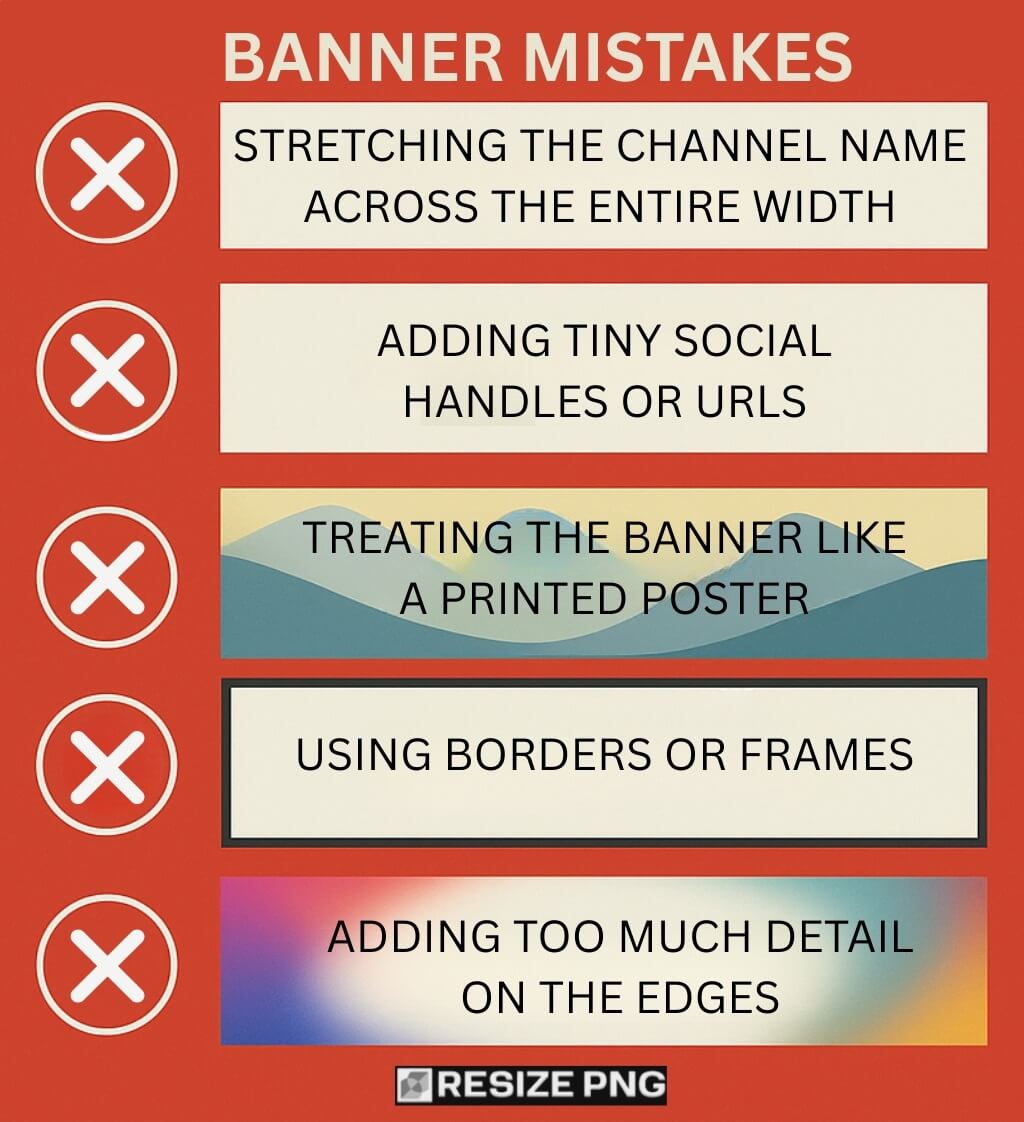
Mistake 1: Stretching the channel name across the entire width
Fix: Keep the name inside the safe area. Shorten it if needed.
Mistake 2: Adding tiny social handles or URLs
Fix: Skip them or move them to your About section. Tiny text always loses.
Mistake 3: Treating the banner like a printed poster
Fix: Use one message and one focal point. Posters can hold more content. Banners cannot.
Mistake 4: Using borders or frames
Fix: Remove them. YouTube warns against decorative edges that break when cropped.
Mistake 5: Adding too much detail on the edges
Fix: Keep edges simple. Use blur, gradients, or low detail.
Quick Banner Layout Recipes That Work
Recipe A: Minimal expert channel
- Background: solid dark tone or light neutral gradient
- Center: channel name and short keyword phrase
- Optional: a small, clean logo
Examples of center text:
- “Home Maintenance Playbook”
- “Practical Data Science”
- “Math Problem Solving”
This layout travels well across all devices.
Recipe B: Personality-focused creator
- Background: subtle texture or soft photograph
- Center: close-cropped portrait, name, short tagline
- Rules: keep the face inside the safe area
This is the right choice for creators whose personality or presence drives the channel.
Recipe C: Series-based channel
-
- Background: branded color blocks or simple panels
- Center: series name and a concise posting cadence
- Tip: keep the cadence short, like “New episodes weekly.”
Simple formats like this hold up well because the message is tightly controlled.
Banner Checklist Before You Publish
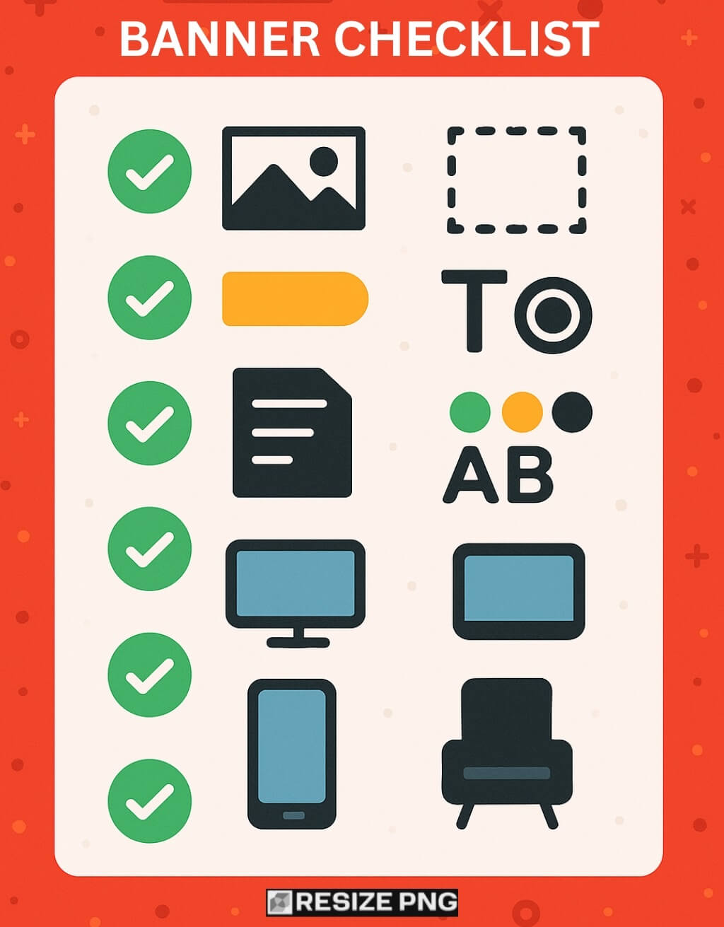
Use the list below to avoid accidental mistakes:
- Canvas set to 2560 x 1440
- Safe area respected at 1546 x 423
- All text and logos are centered inside that zone
- No borders, frames, or heavy drop shadows
- File size under 6 MB
- Color palette and typeface match thumbnails
- Safe area elements remain readable on mobile preview
- Background remains clean on TV preview
If you hit every point, your banner will hold up across devices without mystery cropping or blurry artifacts.
Final Thoughts
A YouTube banner only has one job. It tells a visitor who you are before they watch anything. That job sounds simple, but the range of screen sizes makes it a surprisingly technical part of channel branding.
Fortunately, the rules are stable and generous. Stick to the correct dimensions, respect the safe area, keep your message focused, and treat the outer edges as pure background.
Once you follow that path, your banner becomes a reliable part of your channel identity instead of a frustrating design puzzle.