
In the fast-moving Shopify landscape of 2026, mediocrity is the enemy of conversion. The industry “gold standard” remains 2048 x 2048 px in a 1:1 aspect ratio.
While Shopify technically permits massive canvases up to 5000 x 5000 px (or 25 megapixels), bigger isn’t always better; the 20 MB file limit is a hard ceiling you should respect. For the latest technical boundaries, consult Shopify’s official product media documentation.
Think of a 2048 px square master as your high-fidelity anchor. It provides enough “juice” for crystal-clear pinch-to-zoom and retina-grade collection cards without bloating your server load.
Of course, aesthetics matter: fashionistas and furniture moguls often pivot to a sleek 4:5 ratio (1600 x 2000 px) to capture vertical elegance.
The cardinal sin of e-commerce? Inconsistency. Pick a signature ratio, stick to it religiously, and let Shopify’s powerful CDN handle the heavy lifting of downscaling for mobile users.
Best Shopify Image Dimensions at a Glance
Generic solutions don’t exist in high-end design. Your specific product silhouette and theme architecture dictate the ideal source file.
| Image use | Recommended dimensions | Aspect ratio | Best use |
| Main product image | 2048 x 2048 px | 1:1 | General retail, beauty, electronics |
| Portrait product image | 1600 x 2000 px | 4:5 | Fashion, footwear, bottles |
| High-detail portrait | 2000 x 2500 px | 4:5 | Premium goods needing closer inspection |
| Landscape product image | 2400 x 1600 px | 3:2 | Furniture, equipment, wide bundles |
| Lifestyle gallery image | 2400 x 1600 px | 3:2 | In-use scenes and secondary media |
| Collection card or thumbnail | Use the main master | Match catalogue ratio | Keeps grids visually consistent |
Don’t waste time uploading separate thumbnails. Shopify’s backend is sophisticated enough to slice your high-res masters into lightweight renditions for every corner of your layout automatically.
Why 2048 x 2048 px is the Best General Standard
A 2048 px square is the sweet spot where surgical detail meets performance. It’s the highest resolution most modern browsers can actually leverage effectively before hitting the law of diminishing returns found in 5000 px files.
Regarding Shopify’s maximums as an “in case of emergency” ceiling. For non-product theme assets, you’re playing with a 20 MB/20 MP limit, detailed further in the theme image guidelines.
Context is everything. A diamond ring requires more forensic clarity than a plastic bin. Only scale past 2048 px when fabric textures or intricate engravings are a core selling point; extra pixels shouldn’t just take up space.
Which Aspect Ratio Should a Shopify Store Use?

Your chosen ratio defines the “vibe” of your catalogue. While square is the universal safe bet, specialized niches demand a more tailored geometric approach.
Square Images Work for Most Catalogues
A 1:1 ratio is your best friend for diverse inventories. It’s the ultimate responsive shape, fitting snugly into mobile grids without awkward cropping.
Perfect for watches, beauty supplies, and gadgets. Pro tip: maintain “breathing room” around your subject so dynamic theme crops don’t chop off the edges of your product.
Framing is just as vital as size. A grid looks amateur if one product is zoomed in while the next is a tiny speck in a vast white sea. Aim for visual rhythm.
Portrait Images, Suit Fashion, and Tall Products
The 4:5 ratio is the secret weapon for apparel. It grants vertically oriented goods—like long coats or tall bottles- a commanding presence on the screen. Start with 1600 x 2000 px.
Portrait formats are built for human forms. Ensure your cropping stays consistent across the entire collection to prevent a “jittery” scrolling experience that confuses the eye.
Luxury brands might opt for 2000 x 2500 px to showcase premium craftsmanship, but use this sparingly; standard thumbnails will rarely reveal that extra level of detail.
Landscape Images Require Theme Testing
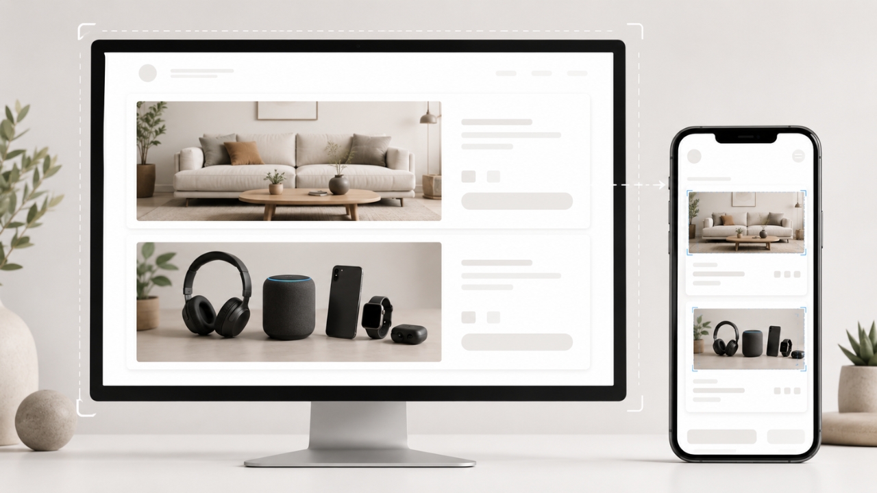
Wide-angle 3:2 ratios (around 2400 x 1600 px) are made for sofas, tech bundles, and cinematic spreads. They tell a story that square crops are often cut short.
Warning: wide images often shrink into oblivion on mobile phones. Test your templates before committing your whole catalogue to a landscape default.
File Format Matters as Much as Dimensions
Default to high-grade JPEGs for photography. Only break out the PNGs for logos, illustrations, or when a transparent cut-out is non-negotiable.
While Shopify supports WebP and SVG, avoid bloated PNG photos. A hefty PNG can weigh twice as much as a JPEG without a visible upgrade in quality.
Thankfully, Shopify is smart. It will automatically convert and serve WebP or AVIF versions to browsers that support them, so you don’t have to micromanage every export.
Always export in the sRGB color space. Shopify strips custom profiles, and you don’t want your vibrant fashion collection looking “muddy” on a customer’s tablet.
How Product Images Affect Shopify Page Speed
View this post on Instagram
Page speed dies when a theme requests 2000 pixels for a 200-pixel thumbnail. Efficient themes are the key to unlocking true performance.
Leverage Liquid’s srcset to ensure mobile users aren’t downloading desktop-heavy assets. Depth on this strategy can be found in Shopify’s performance guide.
Monitor your Largest Contentful Paint (LCP). Google wants to see that first product image in under 2.5 seconds. For the metrics that matter, see the Core Web Vitals documentation.
Prioritize your hero image and lazy-load the rest. A professional theme loads the first photo instantly and keeps the secondary gallery in the wings until needed.
Don’t rely solely on automation. Sloppy custom code can still force a browser to load a massive gallery before the user even scrolls, killing your page rank.
Weight Benchmarks for the Pro Merchant
While there’s no “perfect” size, aim for efficiency. A lifestyle shot with a complex forest background will always be heavier than a clean studio product photo.
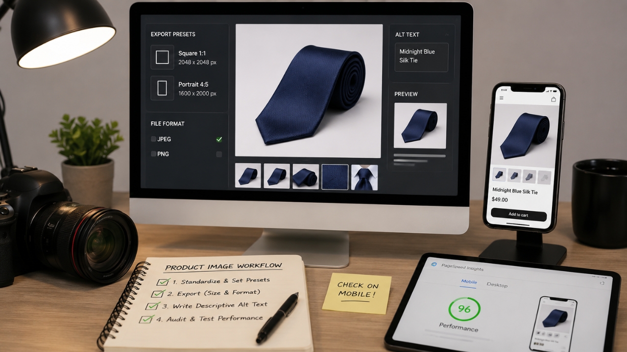
Remember, Shopify stores your original master. Don’t over-compress before uploading, or you’ll bake in ugly artifacts that can’t be removed later. Maintain a high-quality “Vault” of original photos. Export clean, web-ready versions for Shopify, then verify the rendered results in your live theme. Standardize early. Create export presets for 2048 px square or 1600 px portrait layouts. Consistency in background and lighting is what separates the pros from the hobbyists. Export main files at 2048 x 2048 px for square layouts or 1600 x 2000 px for 4:5 pages. Use JPEG for ordinary photography and PNG only where transparency or graphic precision is necessary. Write descriptive alt text, not keyword stuffing. “Midnight Blue Silk Tie” beats a string of SEO keywords every time. Check the theme requirements for deeper technical compliance. Audit your work. Use PageSpeed Insights on actual product URLs, not just the home page. Check how those crops look on an iPhone – if your hero product looks cut off, go back to the drawing board. The “Jigsaw Effect”: Mixing square and landscape images in a collection grid makes your store look messy and unorganized. Stick to one ratio. Never bake text into your images. It’s a nightmare for accessibility and mobile responsiveness. Google’s image guidance confirms that embedded text is invisible to search engines—keep your copy in HTML. Massive source files are useless if your theme code doesn’t know how to request smaller versions. Ensure your developers aren’t hardcoding desktop-sized assets for mobile viewports. Curate, don’t accumulate. Five high-impact photos showing scale, texture, and use are infinitely better than twenty repetitive shots that bloat your page load time. For the elite merchant in 2026, the directive is clear: 2048 x 2048 px square JPEGs are the standard. Reserve 4:5 ratios for fashion, and use landscape media only for storytelling. Combine uniform ratios with smart CDN usage and a performance-first theme. Your store’s speed and your bottom line depend on the discipline of your image strategy. Great stores start with great photos. Exceptional stores finish with a workflow that prioritizes speed and professional consistency across every single pixel.
A Clean Product-Image Workflow
Avoid These Common Amateur Blunders
FAQs
The Final Verdict