
For most marketing websites in 2026, a safe desktop hero image export is 1920 x 1080 pixels for full-width 16:9 layouts, with 2400 x 1350 or 2560 x 1440 used only when large retina desktop screens matter.
For fast pages, do not serve one giant file to every visitor. Create responsive variants, often 640, 960, 1280, 1600, 1920, and 2400 pixels wide, then let srcset and sizes choose the right file.
Keep the delivered hero image roughly 100 to 300 KB whenever possible, use AVIF or WebP, reserve its aspect ratio in HTML, and avoid lazy-loading the above-the-fold hero.
The reason is simple: the hero image is often the Largest Contentful Paint element, and Google’s good LCP threshold is 2.5 seconds or less.
Best Website Hero Image Size In 2026
The best hero image size depends on layout width, aspect ratio, device pixel ratio, and compression, but most websites can start with a 1920-pixel-wide image for desktop and generate smaller versions for mobile and tablet.
A hero image is the large visual at the top of a homepage, landing page, product page, service page, or article template. On many websites, it is the first image a visitor sees and often the largest visible element in the first screen. That makes hero image sizing both a design decision and a performance decision.
A full-width desktop hero usually needs enough pixels to look crisp on common laptop and monitor widths. A 1920 x 1080 source works well for many 16:9 layouts because it covers a 1920 CSS-pixel viewport at standard density and can still compress reasonably.
A 2400 x 1350 source gives more room for high-density displays and visual cropping, but it must be compressed carefully or served only to screens that need it.
| Hero Layout | Recommended Source Size | Aspect Ratio | Practical Use |
| Full-width desktop hero | 1920 x 1080 | 16:9 | SaaS, agency, corporate, local business sites |
| Large premium desktop hero | 2400 x 1350 | 16:9 | Photography, luxury, portfolio, design-led sites |
| Ultra-wide hero crop | 2560 x 1100 | About 21:9 | Wide desktop banners with shallow height |
| Split hero image | 1200 x 900 | 4:3 | Landing pages with text on one side |
| Mobile hero crop | 960 x 1200 | 4:5 | Portrait mobile sections |
| Blog featured hero | 1600 x 900 | 16:9 | Articles, guides, resources |
Why Hero Image Size Matters More Nowadays
Hero image size matters more in 2026 because pages are heavier, AI search systems reward clear and crawlable page experiences, and Core Web Vitals still influence how Google evaluates page experience.
According to the 2025 Web Almanac, the median homepage reached 2.86 MB on desktop and 2.56 MB on mobile, with images accounting for the largest byte share on homepages. Desktop homepages used about 1,058 KB of images, while mobile homepages used about 911 KB.
A single oversized hero image can consume a large part of that image budget before fonts, scripts, product images, icons, analytics, or embedded media even start loading. For a business homepage, that can mean a slower first impression.
For an ecommerce page, it can mean slower product discovery. For a publisher, it can delay the article area above the fold.
Google’s documentation connects Core Web Vitals with search page experience signals, and LCP remains the loading metric most directly affected by a large hero image.
A practical hero strategy therefore needs to balance sharp desktop display quality with fast delivery on mobile and lower-bandwidth connections.
Desktop Hero Image Dimensions
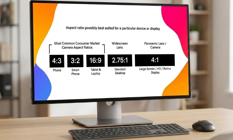
Use 1920 x 1080 pixels as the default desktop hero source for a full-width 16:9 layout, then add a 2400-pixel-wide version only for layouts where visual sharpness justifies extra bytes.
The mistake is exporting only one large 3000 or 4000 pixel image and placing it into a hero area that displays at 1440 or 1600 CSS pixels. The browser may download far more pixels than needed. The visitor sees no meaningful visual gain, but the page pays in bandwidth, decoding time, and LCP delay.
A better setup is a responsive image set:
| Variant Width | Good For |
| 640 px | Small mobile screens |
| 960 px | Large phones and narrow tablets |
| 1280 px | Tablets and small laptops |
| 1600 px | Standard desktop layouts |
| 1920 px | Full-width desktop heroes |
| 2400 px | Retina or visual-heavy desktop layouts |
In modern responsive markup, image performance guidance explains that sizes describes the intended display size of an image in CSS pixels, while srcset gives the browser candidate image files. Together, they allow the browser to pick a file that fits layout width and screen density.
Recommended Aspect Ratios For Hero Images
The safest website hero aspect ratio in 2026 is 16:9, but many designs perform better with a wider or taller crop depending on screen and message.
A 16:9 hero is predictable, familiar, and easy to reuse across websites, CMS previews, video thumbnails, and social graphics.
A 21:9 crop feels more cinematic on desktop but can lose important details on mobile.
A 4:5 crop often works better for mobile-first landing pages, especially when a person, product, or app screen must remain visible.
| Aspect Ratio | Pixel Example | Best Fit | Watch Out For |
| 16:9 | 1920 x 1080 | General website heroes | Can become too short on mobile |
| 21:9 | 2560 x 1100 | Wide desktop banners | Heavy cropping on phones |
| 3:2 | 1800 x 1200 | Editorial and brand sites | Less cinematic feel |
| 4:3 | 1600 x 1200 | Split layouts | Can feel tall on desktop |
| 4:5 | 960 x 1200 | Mobile portrait heroes | Poor fit for wide desktop backgrounds |
Keep the subject near the center third of the image. Avoid placing faces, product details, or text near the far edges, because responsive cropping may remove them.
File Size Target For Fast Hero Images
Aim for a delivered hero image between 100 and 300 KB for most business websites, while allowing up to 400 or 500 KB only for image-led brands where visual fidelity has measurable value.
The 2024 Web Almanac found that many mobile LCP images were already relatively small, with 48% of mobile websites using an LCP image of 100 KB or less, yet 8% still used an LCP element above 1000 KB. The same report also found that 16% of mobile pages with image-based LCP were still lazy-loading the LCP image, a known performance anti-pattern.
That gap matters. A 1 MB hero image can still look beautiful, but it competes with CSS, fonts, JavaScript, and server response time. On slower networks or lower-end devices, the browser also has to decode the image before it can paint it.
A practical hero image budget:
| Website Type | Suggested Delivered Hero Weight |
| Local service website | 100 to 200 KB |
| SaaS homepage | 150 to 300 KB |
| Ecommerce category hero | 150 to 350 KB |
| Portfolio or photography site | 250 to 500 KB |
| News or blog article hero | 100 to 250 KB |
The exported source file can be larger in a CMS or image CDN, but the file delivered to the visitor should fit the viewport.
Best Image Format: AVIF, WebP, JPEG, Or PNG?
Use AVIF or WebP for photographic hero images in 2026, with JPEG as a fallback where needed and PNG reserved for graphics requiring transparency or sharp flat-color edges.
Chrome’s current image delivery guidance says AVIF and WebP provide better compression and quality characteristics than older JPEG and PNG formats.
| Format | Best Use | Notes |
| AVIF | Photos, gradients, detailed hero visuals | Excellent compression, slower encoding in some workflows |
| WebP | Broad CMS compatibility and fast delivery | Strong default for WordPress, Shopify, Webflow, and custom sites |
| JPEG | Legacy fallback | Still acceptable with correct compression |
| PNG | Logos, transparency, UI graphics | Usually too heavy for large photo heroes |
| SVG | Simple vector graphics | Good for shapes, logos, icons, not photos |
For most teams, WebP is the easiest production default. AVIF is often worth adding through an image CDN that can negotiate format automatically.
Hero Images And Largest Contentful Paint
The hero image should load early, because it is frequently the LCP element on landing pages and homepages.
For LCP optimization, web.dev warns against lazy-loading the LCP image because lazy loading delays discovery and harms LCP.
For an above-the-fold hero image:
- Use normal eager loading, not loading=”lazy”.
- Add fetchpriority=”high” to the main hero image.
- Keep the image URL discoverable in the initial HTML.
- Avoid hiding the real image behind JavaScript.
- Avoid using CSS background images for important LCP content.
MDN describes fetchpriority as a way to signal that a resource has higher or lower user-experience impact than the browser may infer on its own. For important images, including LCP images, web.dev also recommends high fetch priority in suitable cases.
Why CSS Background Heroes Can Be Risky
CSS background heroes can look clean in design tools, but they are often worse for performance and accessibility than an HTML <img> or <picture> element.
A browser can usually discover an <img> source during HTML parsing. A CSS background image may be discovered later, after CSS is downloaded and parsed. CSS backgrounds are still useful for decorative texture, gradients, abstract patterns, and visual layering. Use semantic image markup for an important hero photo, product shot, editorial image, or brand visual that communicates meaning.
Responsive Image Markup Example
A good hero image setup gives the browser several file widths and a clear sizes rule. Example:
<img
src=”/images/hero-1600.webp”
srcset=”
/images/hero-640.webp 640w,
/images/hero-960.webp 960w,
/images/hero-1280.webp 1280w,
/images/hero-1600.webp 1600w,
/images/hero-1920.webp 1920w,
/images/hero-2400.webp 2400w”
sizes=”(max-width: 767px) 100vw, (max-width: 1199px) 100vw, 100vw”
width=”1920″
height=”1080″
alt=”Team reviewing website analytics on a desktop screen”
fetchpriority=”high”
decoding=”async”>
The width and height attributes reserve space before the file fully loads. Web.dev explains that modern browsers can use image dimensions to set a default image aspect ratio and help prevent layout shifts.
Cropping Rules For Sharp Desktop Displays
Design the hero crop around the visible subject, not around the original camera frame.
A hero image often changes shape across breakpoints. Desktop may show a wide crop; mobile may show a taller version.
If the same image must serve both, leave generous negative space around the subject. If quality matters, create separate art-directed crops with <picture>.
Use desktop and mobile crops when:
- A face or product gets cut off on mobile.
- Text overlays need empty space on one side.
- The desktop hero is very wide, such as 21:9.
- The mobile layout moves text above or below the image.
- A CMS template has strict image ratios.
Google’s image SEO guidance recommends descriptive filenames, titles, and alt text, while placing images near relevant text on relevant pages.
That matters more in AI search environments where visual context, page text, and entity clarity may all influence how a page gets interpreted.
WordPress, Shopify, Webflow, And Custom Sites
The recommended dimensions stay similar across CMS platforms, but implementation differs.
WordPress can generate multiple image sizes, yet many themes still output oversized hero images unless template code defines proper srcset, sizes, and featured-image dimensions. Shopify themes often rely on CDN transformations, so image width parameters can be used to deliver the right crop.
Webflow supports responsive images, but background image heroes may still need extra performance attention. Custom React, Next.js, Astro, or Nuxt builds should use framework image components carefully, with explicit priority only on the true above-the-fold hero.
One warning: do not give every image high priority. Reserve priority signals for the main above-the-fold hero or key LCP candidate. When every asset is urgent, prioritization loses meaning.
Quick Hero Image Checklist For 2026
Use a clear checklist before publishing any major page:
- Export a master image at 1920 x 1080 or 2400 x 1350.
- Generate responsive widths: 640, 960, 1280, 1600, 1920, 2400.
- Use AVIF or WebP where supported.
- Keep the delivered file near 100 to 300 KB when possible.
- Add srcset and sizes.
- Add width and height.
- Avoid lazy-loading the visible hero.
- Add fetchpriority=”high” only to the main hero.
- Use descriptive alt text if the image carries meaning.
- Test LCP in Lighthouse, PageSpeed Insights, and field data where available.
Summary
The best website hero image size in 2026 is not one magic number. A practical default is 1920 x 1080 pixels for full-width desktop heroes, supported by responsive variants and a larger 2400 x 1350 option for premium desktop displays. The real win comes from serving the smallest sharp image each visitor needs.
A sharp hero image should look intentional on a desktop monitor, crop cleanly on mobile, and load early enough to support a good LCP score. Use responsive markup, modern formats, explicit dimensions, and careful priority settings. A hero image should sell the page visually, not slow the first impression.