
If you’re looking to keep your Etsy shop photos looking sharp and avoid those annoying “heads-chopped-off” thumbnails in 2026, the vibe is simple: upload images at least 2000 pixels on the shortest side. Stick to a square (1:1) or 4:3 landscape frame, keep your product centered, and you’re golden.
Etsy’s official image guidance is a great starting point for high-res shots, but remember that the platform shifts layouts between desktop, mobile, and shop pages. Because things look different everywhere, no single ratio is a “perfect” fix for every device.
The smartest move? Give your product some breathing room. Using generous margins ensures that even if Etsy decides to crop your thumbnail, the important stuff stays right in view.
For anyone selling in 2026, composition is just as vital as photo quality. You could have the most beautiful item in the world, but it won’t get clicks if it looks awkward in a search result.
Pro Specs For Your Etsy Listing Photos
| Setting | The Expert Pick |
| Minimum image size | 2000 pixels on the shortest side |
| Ideal upload size | 3000 × 3000 px or 3000 × 2250 px |
| Best aspect ratio | 1:1 or 4:3 |
| File format | JPG is the go-to; PNG/GIF are okay too |
| Max listing photos | 10 images (use them all!) |
| Color profile | sRGB for true colors |
| Product placement | Centered with lots of breathing room |
Etsy pushes for at least 2000 pixels because they want your customers to see every detail when they use that zoom tool.
The Reality Of Why Photos Still Crop
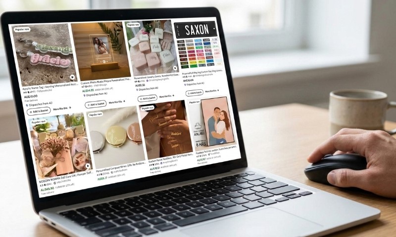
The confusing part is that Etsy doesn’t use one single thumbnail size. Your listing shows up differently depending on where the buyer is hanging out.
Someone might find your awesome products in:
- Desktop search pages
- Mobile browsing
- The Etsy app interface
- Your specific shop homepage
- “Recommended” modules
- Direct marketing emails
Every spot can use a slightly unique crop. Expert sellers don’t sweat the exact pixels anymore; they just build in a “safe zone” to avoid bad crops across all devices.
Picture a cool ceramic mug. Instead of zooming in until it hits the edges, leave some white space. If Etsy crops the sides, your mug still looks whole and professional.
That one little tweak makes your whole shop look instantly more high-end.
Square Or 4:3? Let’s Decide
Both ratios are totally fine, but it really depends on what kind of magic you’re selling.
| What You Sell | The Ratio Vibe | The Reason |
| Jewelry | 1:1 | Keep those tiny details centered |
| Stickers | 1:1 | Looks clean and uniform in search |
| Candles | 1:1 | Safest for vertical items |
| Clothing | 4:3 | Shows off more of the fit |
| Furniture | 4:3 | Better for wider, statement pieces |
| Home décor | 4:3 | Room for context and styling |
| Art prints | Dealer’s choice | Match the artwork’s natural flow |
Square is usually the safest bet because Etsy loves those compact layouts for search and shop grids.
That said, plenty of pros stick with 4:3 because it gives larger products more room to shine while still playing nice with Etsy’s cropping logic.
Picking The Best Pixel Dimensions
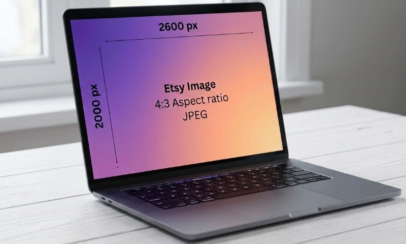
While there’s a minimum, going a bit bigger gives your customers a much better zoom experience.
Industry guides like Soona’s Etsy image size specs often suggest exporting at 3000 pixels to ensure your product presentation is as sharp as possible.
| Size (Pixels) | The Ratio | Expert Recommendation |
| 2000 × 2000 | 1:1 | The bare minimum for quality |
| 3000 × 3000 | 1:1 | The “Gold Standard” for quality |
| 3000 × 2250 | 4:3 | Perfect for wider shots |
| 2700 × 2025 | 4:3 | A great middle ground |
Don’t go overboard with massive files, Etsy compresses them anyway, but you can also optimize photos by yourself. Aim for clean, crisp details rather than just a huge file size.
How To Chill And Avoid Bad Crops
A stress-free thumbnail usually follows these five pro tips.
Always Keep It Centered
Don’t put your product too close to the edge. Centering it means Etsy can crop away without losing the star of the show.
Give It Some Air
It’s tempting to zoom in tight, but leave about 10-20% margin around your product. It looks way cleaner.
That buffer is your safety net against weird layouts.
Watch Out For Border Text
If you’re adding text or dimensions, keep them well away from the edges so they don’t vanish on mobile screens.
Do A Quick Device Test
Before you go live with 100 listings, check one out on:
- Your laptop browser
- An iPhone
- An Android device
- The actual Etsy app
You’ll be surprised how different the crops can look between screens!
Keep The Look Consistent
Uniform composition makes your shop look legit. Buyers love when thumbnails line up perfectly, it feels more professional.
How Many Photos Do You Really Need?
View this post on Instagram
You’ve got 10 slots and a video, use them! Don’t miss the chance to answer buyer questions before they even have to message you.
A pro-level gallery usually has:
- The “Hero” shot
- A different angle
- Macro/detail shots
- Scale comparison (handy!)
- In-use lifestyle photo
- Packaging/unboxing vibe
- A clear size chart
- Texture/material close-up
- Available color options
- Feature highlights
Photo experts always recommend filling all your slots because more info leads to more confident buyers.
Does Res Matter For Search Rankings?
Etsy doesn’t officially confirm image quality as a ranking factor, but fuzzy photos definitely hurt your shop’s performance indirectly by causing:
- Fewer clicks
- Lower conversion rates
- High “bounce” rates
- Less trust from buyers
Etsy loves happy shoppers. A crisp first image helps them quickly find what they need and feel good about clicking that “Add to Cart” button.
High-quality shots also future-proof your shop. Low-res images look soft on modern 4K screens, especially when people zoom in to check out your craftsmanship.
JPG Or PNG? The Debate
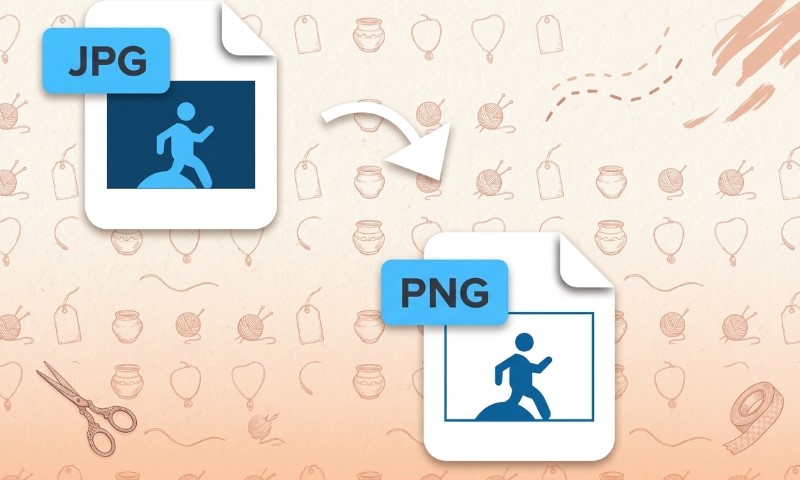
For most shops, JPG is still king for product photography.
| The Format | When To Use It |
| JPG | Best for real-life photos |
| PNG | Great for graphics/logos |
| GIF | Not usually needed |
JPGs keep file sizes manageable while looking great. Exporting at 80-90% quality is usually the perfect balance.
Avoid These Common Blunders
Here are the traps many new sellers fall into, don’t be one of them!
The “Too Close” Crop
If your product touches the edges, Etsy is going to cut off the corners. Give it space.
Ratio Chaos
Mixing square, portrait, and landscape shots makes your shop look messy. Stick to one and stay consistent.
Tiny, Soft Images
Uploading the absolute minimum size makes your shop look dated on modern high-res screens.
Dim Lighting
Lighting is everything. Even a basic smartphone can take pro shots if you find some nice window light.
Distracting Backgrounds
Too many props can confuse buyers. Your main image should clearly show exactly what is for sale.
The 2026 Pro Workflow
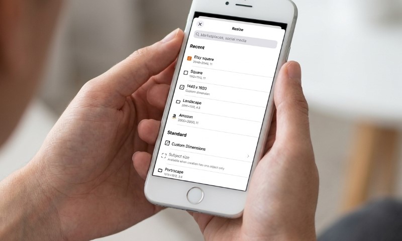
Follow this simple flow to keep your shop looking top-tier.
- Shoot at your camera’s highest resolution.
- Tweak exposure and colors until they pop.
- Crop to your chosen ratio (1:1 or 4:3).
- Make sure that product is dead center.
- Export around 3000 pixels.
- Stick to the sRGB color profile.
- Preview everything on desktop and phone!
This system keeps your whole catalog looking tight and professional.
FAQs
Final Thoughts
Nailing your Etsy photos in 2026 is less about finding a secret formula and more about being smart with your composition across every device.
Stick to 2000+ pixels, keep it centered with some air around it, and be consistent with your chosen ratio for the best results.
If you preview on both desktop and phone, you’ll catch those pesky crops before your customers ever do. You’ve got this!